Team Roar
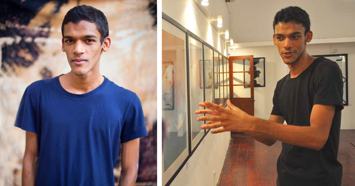
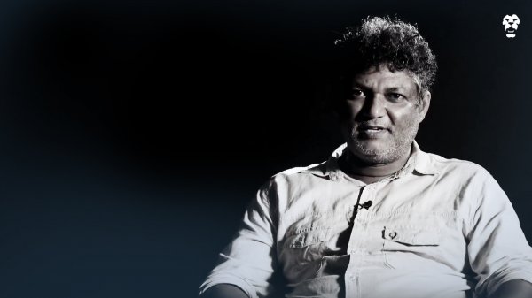
Kavan Balasuriya’s exhibition, ‘Lightlines,’ just concluded at Saskia Fernando Gallery, where it was showing for a month. In this Q&A, he speaks to Roar Media about the process of creating and refining his work and how the exhibition came together.
Roar: What was the concept or inspiration behind your latest exhibition at Saskia Fernando Gallery, Lightlines?
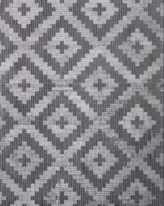
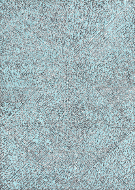
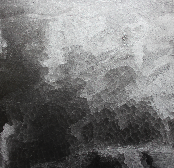
Kavan Balasuriya: It is the result of a long-standing drawing practice, which incorporates many themes as an ongoing thought process, and ideas that I’ve been interested in over a period of time. What makes this show the way it is, is the particular use of aluminium foil as a medium through which I can express my ideas and the themes that I’m looking at. ‘Medium’ is an interesting word, because it’s not really limited to material, but it’s like a conduit, something through which you can channel other things, channel ideas. It’s using this [aluminium] as a medium, but also questioning what drawing can be, what a drawing can do, what it’s meant to be, how it can be presented through the conventionality of it, and how to push and expand on the boundaries of that convention — and that eventually broke into engraving, as well. So these are drawings and engravings on aluminium foil, for the most part, and they look at what drawing can be.
Roar: What mediums and tools did you use primarily in creating the art in this exhibition?
KB: It all started by looking at how I can use unconventional, alternative, freely available material that wouldn’t be recycled. I think when I was living in Sri Lanka at the time, a few years ago, when it all started, I think the Meethotamulla disaster happened, and that kind of affected me a bit. I think the government at the time also finally decided to separate recycling and waste disposal [bins], but it made me think,, ‘Half of these aren’t ever going to be recycled — they’re not recycled here in the U.K., even now.’ And it was interesting to make that switch because suddenly you had all this freely available material in industrial quantities – polythene, plastic bags, stuff like that. So I was using that to experiment with making paintings, and creating textures and things, and then eventually, over time, it got more refined. In that process, I realised that I didn’t need to feel so guilty about it. Because guilt definitely ran through it, I didn’t need to feel this guilt or this burden, because I did not produce these items. So eventually, along with that kind of understanding and release, I settled on refining aluminium foil packaging in particular, and I started drawing and engraving on it, just on regular store-bought, things you can buy at the supermarket, aluminium foil rolls which have a very particular material quality to them that I really enjoy. There are ink drawings as well, which is also quite important because they form the foundation of my drawing practice – just regular drawing.
Roar: Your use of colour is very limited – much of the exhibition is black, white and grey with some blue. What was the thought process behind that choice?
KB: That was intentional, actually. I was experimenting with a lot of colours, but it took the whole direction away from the original way of working with materials. It took away from the essence of the material. Everything in the show is monochromatic, apart from one piece and monochrome means a singular colour, it’s not just black, white or grey, it can be blue, it can be red. You can have different tonal deviations, as long as it’s that one colour. [So] these are metallic works, and they are reflective; that reflection itself provides a layer of colour onto it. So it’s not always completely greyscale, the aluminium foil work is totally responsive to its immediate environment. So you can play with lighting, you can play with colour, it absorbs light, it reflects light. What you see is how it is lit from a particular angle, and so you have this really subjective experience of it, but other than that, I think when it comes to traditional drawing, with ink, I find it to be a really effective way of expressing an idea, just to keep it as simple as possible, and for me, you’ve run the risk of complicating things by bringing in other materials, or even colours. In this collection, with the pieces in the show, it has been more effective to keep it to a singular material or a tool, like a pen, or respectively, aluminium foil has its own way of working, as well as drawing with ink. It’s interesting, because you get very subtle reflections of colour as well, on the work. The whole show is focused on this aspect of light. How the material engages with it, what qualities of light it reveals, but also that colour is very much a part of the light.
Is there any specific intention behind the layout of the pieces, or how they’re spaced out or positioned within the space?
KB: That was more of an emotional flow to the space, I think, when I had total control over it and the first pieces that went up were the largest ones, because I just happened to be in that room and it was the perfect space for it. Where the largest pieces are, it’s intended to create this meditative, contemplative space where you are surrounded by free lodge pieces that are just there, and they kind of envelop you in that space, which is the second room. But everything else just kind of slotted into place once I was moving things around. And the show kind of is arranged so that it invites you in, and it pulls you in and opens up little pockets of spaces that have different-sized works, as opposed to just bombarding you with information — it’s a bit more subtle than that. In the last room, I kept the works in there small, deliberately, and of a particular series. Because there were two instances under which you can see some of the pieces in the show which were made with the electric engraver, and the material behaves differently under different lighting conditions. So if you have a piece in a white room under artificial lighting, it’ll be different, but if you have the same piece in a white room with natural lighting, it would behave differently. And of course, if you had it in a dark room with artificial lighting, it behaves differently. So I decided not to put the largest pieces in that dark room, even though it’s the last room and the ultimate room, because the light was so harsh and so sharp that it would not have served to introduce the whole series in that way.
What has the reception to your work been like, or what’s the response you generally get from people who are maybe more used to seeing a very different style of art?
KB: It’s a very different way of working because I don’t think people have approached this way of seeing unconventional material being used in this way. So everything in this practice is an artificial construct, where every single element of it has been appropriated from its original context. So you have foil, which is used in the kitchen and in food preparation and preservation, and then you have the mounting board surface, which is used for photographs and posters, and then you have the engraving tool, which is an industrial one, which is used for harder surfaces like wood, glass, steel and metal and then you have another fine print-making, etching tool, which is from print-making. So I think that combination presents something that’s quite unique, but there’s been good critical feedback from veteran artists, and people seem to like it. For me, it ties back to this idea of what a drawing should be, or what an image or picture can do or can be. There’s a different level of engagement here, because the viewer and you, in the audience, would complete the picture, because it’s also totally responsive to where you are standing in relation to it, in addition to the fact that this is a conventional drawing by a particular standard definition – it’s interesting to play with that.
.png?w=600)